CuraLinc Brand Refresh
CuraLinc provides workforce mental health and EAP administration solutions.

Overview
A new brand platform and visual identity system for a modern leader in the mental health sector.
The challenge
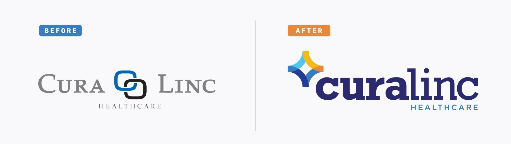
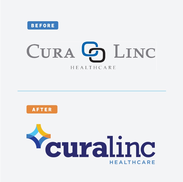
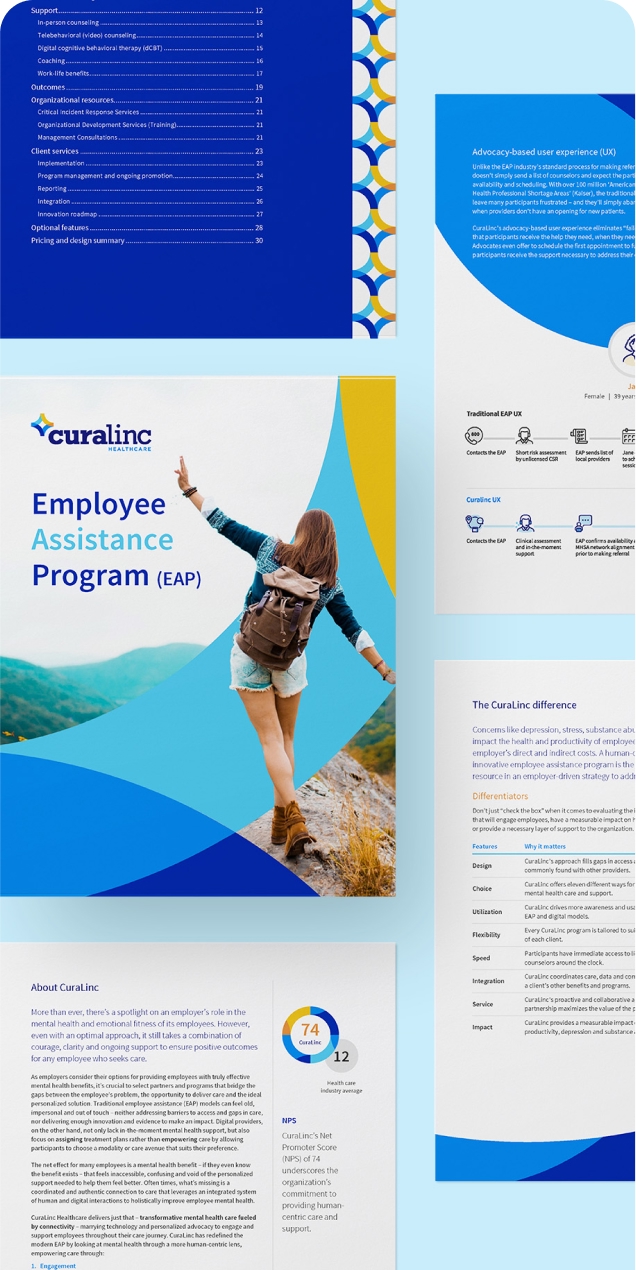
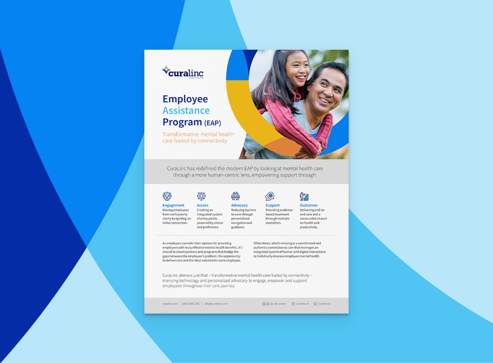
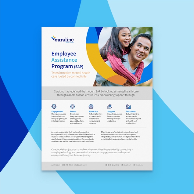
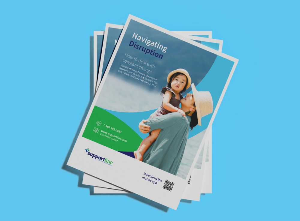
CuraLinc’s existing brand and style guide hadn’t been updated since 2008. Executive leadership wanted a more modern brand mark/logo, visual identity system and templated tools to better reflect their transformative and forward-thinking mental health programs.
The solution
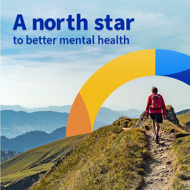
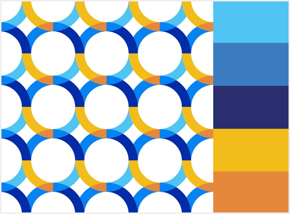
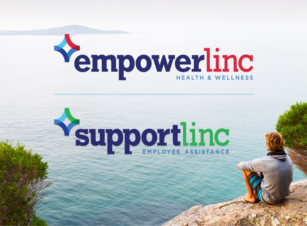
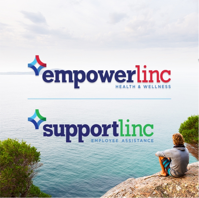
The updated brand platform embodied the company’s identity as an approachable and empathetic industry leader. A new modern brand mark incorporated vibrant and energetic colors while evoking the dependability of the North Star.
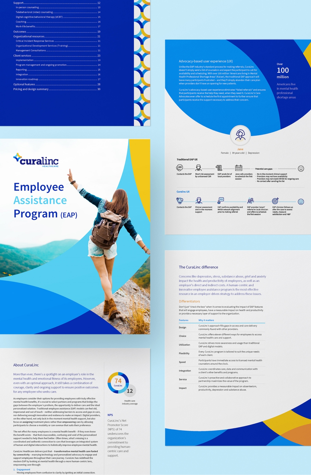
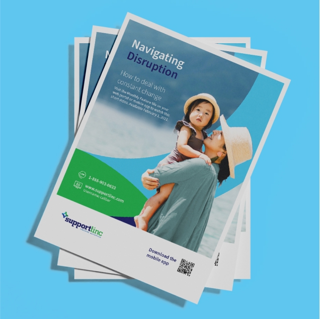
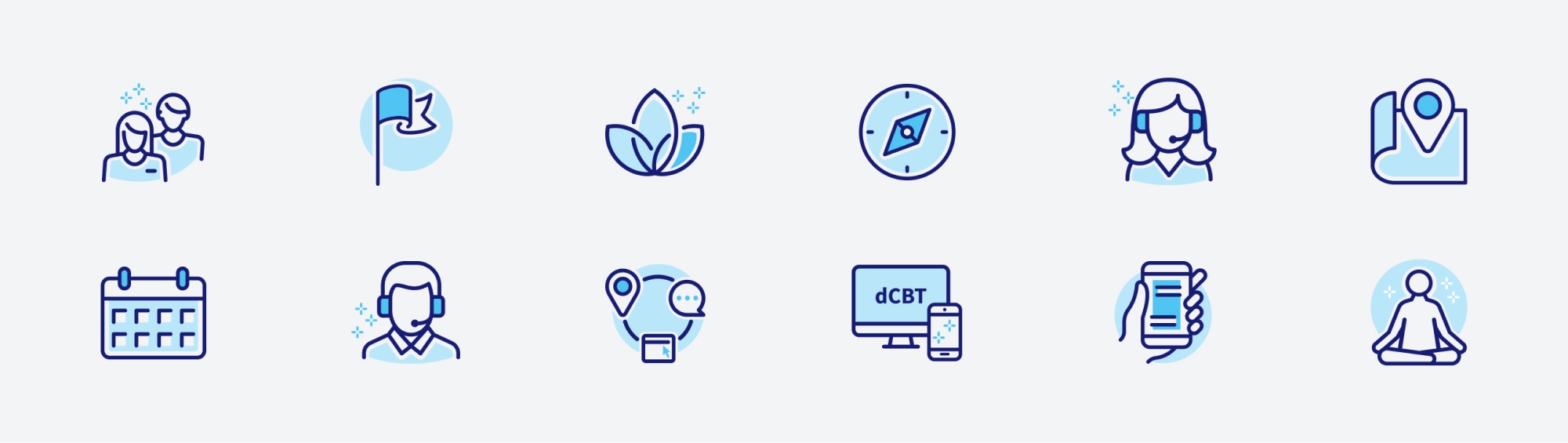
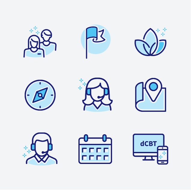
The visual platform (consisting of a new color pallet, fonts, imagery, iconography and various design elements) addressed brand usage and sub-brand recommendations. Initial sales tools included a comprehensive sales narrative, customizable proposal form and templated sell sheets and mailers.
case studies
Success stories